How do we know if a logo needs to be redesigned? What do we consider when envisioning something brand new? Let’s take a look.
Every design project involves multiple phases like research, conceptualization, feedback and review, but we use specific criteria when evaluating a logo. One checklist we’ve found to be valuable is borrowed from celebrated American art director and graphic designer Paul Rand. Paul is best known for his corporate logo designs including IBM, UPS, Enron, ABC and Steve Jobs’ NeXT. [1]
"The principal role of a logo is to identify, and simplicity is its means… Its effectiveness depends on distinctiveness, visibility, adaptability, memorability, universality, and timelessness."
Paul Rand
If you’re trying to evaluate your logo, ask yourselves these questions. We’ll be asking them too.
- Distinctive: Does the logo stand out in your industry and stand apart from your competition?
- Visible: Is the logo noticeable and easily seen? Designers often start with a black and white application to ensure optimal visibility independent of colour.
- Adaptable: Does the logo work regardless of where it’s placed, e.g. on a business card, online, on a truck, on road sign or a piece of clothing?
- Memorable: Is it intuitively memorable by its meaning, shape or form? Is it clever? Does it make you smile? Does it provoke you in any way?
- Universal: Does the logo carry a consistent meaning to a diverse audience? This is especially important for global brands, but also important for local organizations given the diversity of our multi-cultural society
- Timeless: Certain colours, typefaces and styles can go in and out of style quickly. Will the logo have staying power even after current design fads have passed?
- Simplicity: This is arguably the most important criteria. Is the logo simple? Try shrinking it down or blowing it up. Does it work at any size? Can it be drawn by hand in 10 seconds?
Here are some logos that have recently come out of our design team. Try evaluating them based on these criteria and let us know what you think. Leave a comment with your thoughts, or drop us a line if you’d like a free evaluation of your own logo.
"A logo cannot survive unless it is designed with the utmost simplicity and restraint."
Paul Rand

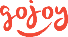
As part of the process of designing packaging for the new Gojoy Superfruit Smoothie Booster, we designed a logo for the Gojoy brand. An inspiration to their consumers, the Gojoy brand is passionate about agriculture – for them it is an art as much as science. They did the impossible by successfully growing Goji berries, the superfruit native to Asia, in Canada – when everyone else said it couldn’t be done. The goal with this logo was to reflect the joy of this success and the brand’s pride in offering a very special product to consumers. The colours were based on the relatively unknown goji berry itself, which is featured prominently on the package. One of the most effective design tools for memorability is to put a smile in the mind of the viewer – a delightfully natural expression for this brand.

Crown Verity designs and manufactures premium, commercial grade food service equipment. Our objective with the new logo was to help Crown Verity develop a clear, confident and premium look. We designed a logo that used strong, classic and timeless typography. References to ‘crown’ are sophisticated and stylized. The overall impression is one of elite performance that is innovative and trustworthy.

We helped DeVry Greenhouses launch a new online-based product called Garden Starters. Inspired by the creation of a garden, this logo combines linear and structural elements to illustrate a gardeners’ starting point, much like a blueprint or drawing. A solid black logo remains true to the notion of a starting point when an individual’s garden is planned. The typeface has both pure and complementary qualities that represent the beauty in both format and order.

We helped Rotoplast Canada, a charity offering free reconstructive surgery to disadvantaged adults and children in developing countries, rebrand to Restor International. The new logo incorporates a smile with the yellow half-circle in the ‘O’ and more literally represents fixing cleft lip and palate anomalies. Bringing attention to the letter ‘O’ also emphasizes the international aspect of the brand by representing its ‘global’ scope. The colour yellow is used to radiate warmth and joy while mainting a sophisticated, professional feel with the grey. The typography is strong and modern but still friendly and approachable. Overall, the feel is credible, approachable, and hopeful.

