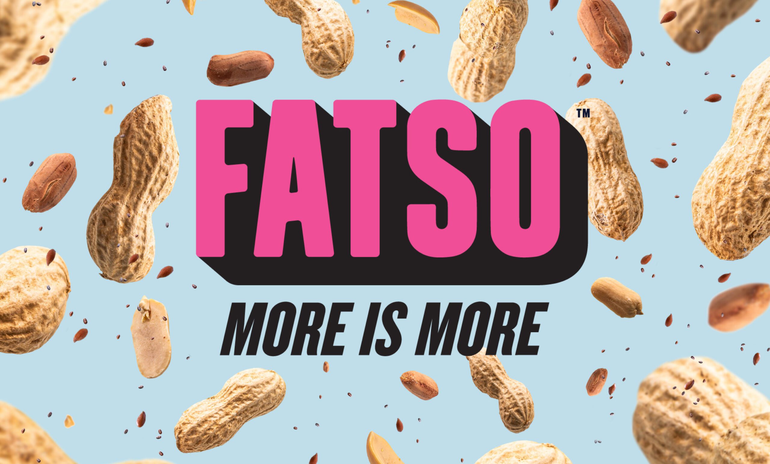
Bold Name. Bold Attitude. Bold Flavour.
| Client | Fatso |
| Work |
|
Challenge
Most consumers shop on autopilot, and stick to what's familiar.
Fatso is packed with plant-based superfats, but many shoppers never stop to try it. They've been buying the same peanut butter brand for years, maybe even since they were kids, and this habitual loyalty can be one tough nut to break.
Strategy
Forget crunchy. We made this peanut butter brand bold and punchy.
Truth is, this ain't the peanut butter you grew up on. So we crafted a brand as bold as the flavors inside the jar. Our "Dense AF!" campaign made peanut butter buyers realize there's a whole new world of nutty goodness to explore.
Results
Increased growth, plus an award-winning brand. (BCFB 2022)
Sure, the brand has been featured by design publications and won awards, but the real winning bit? More retailers, more sales, and new consumers who're sure to become loyal to this brand of nut butters for years to come.

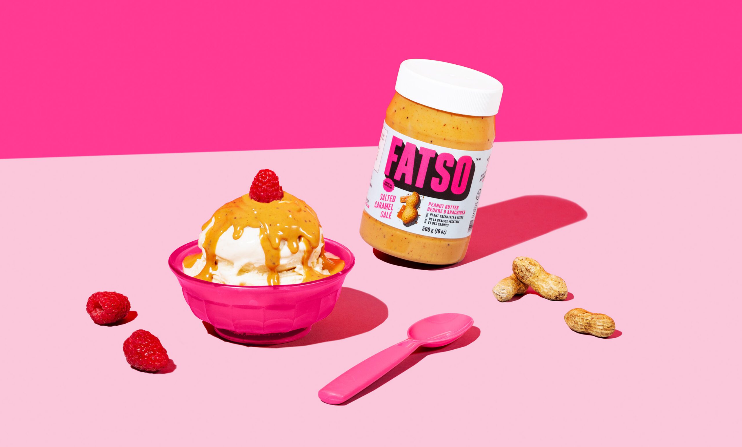
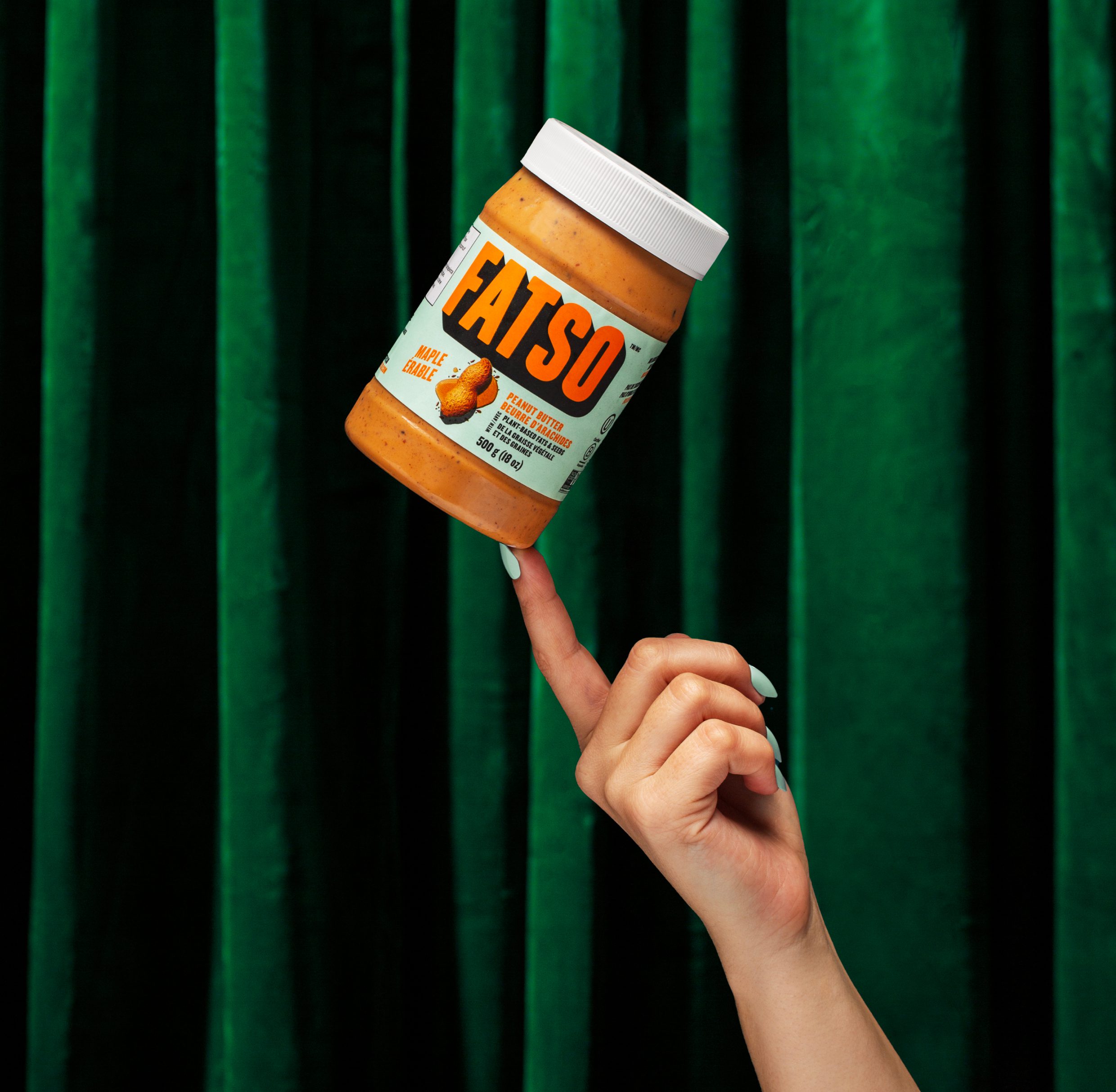
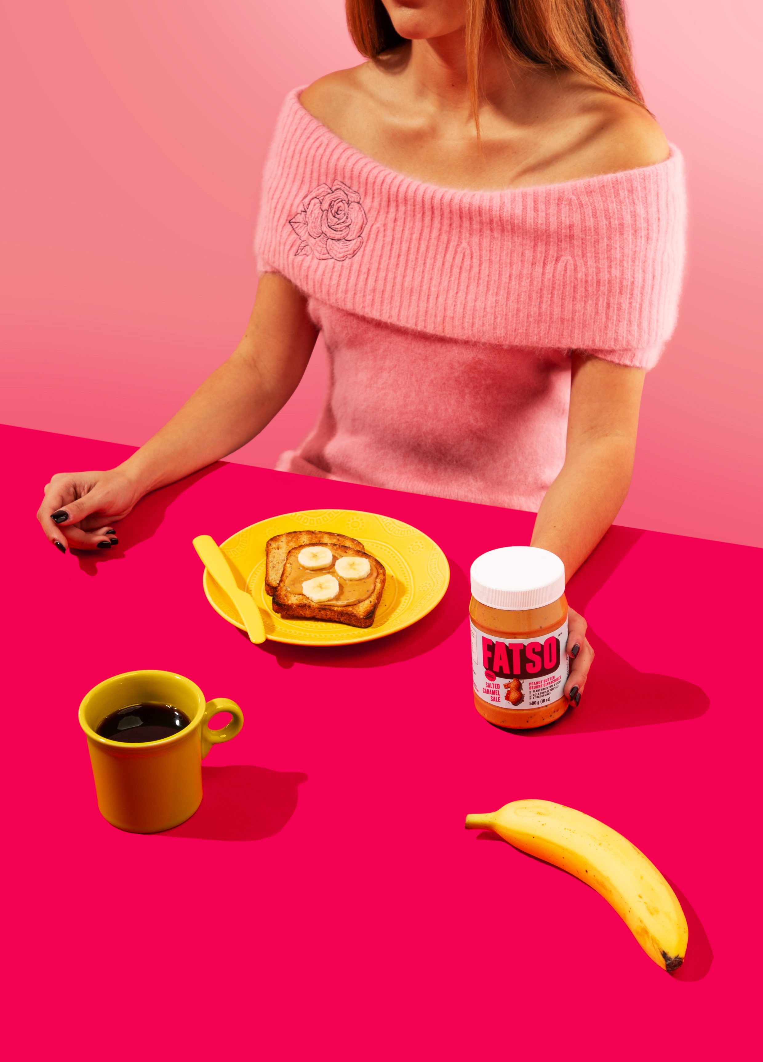
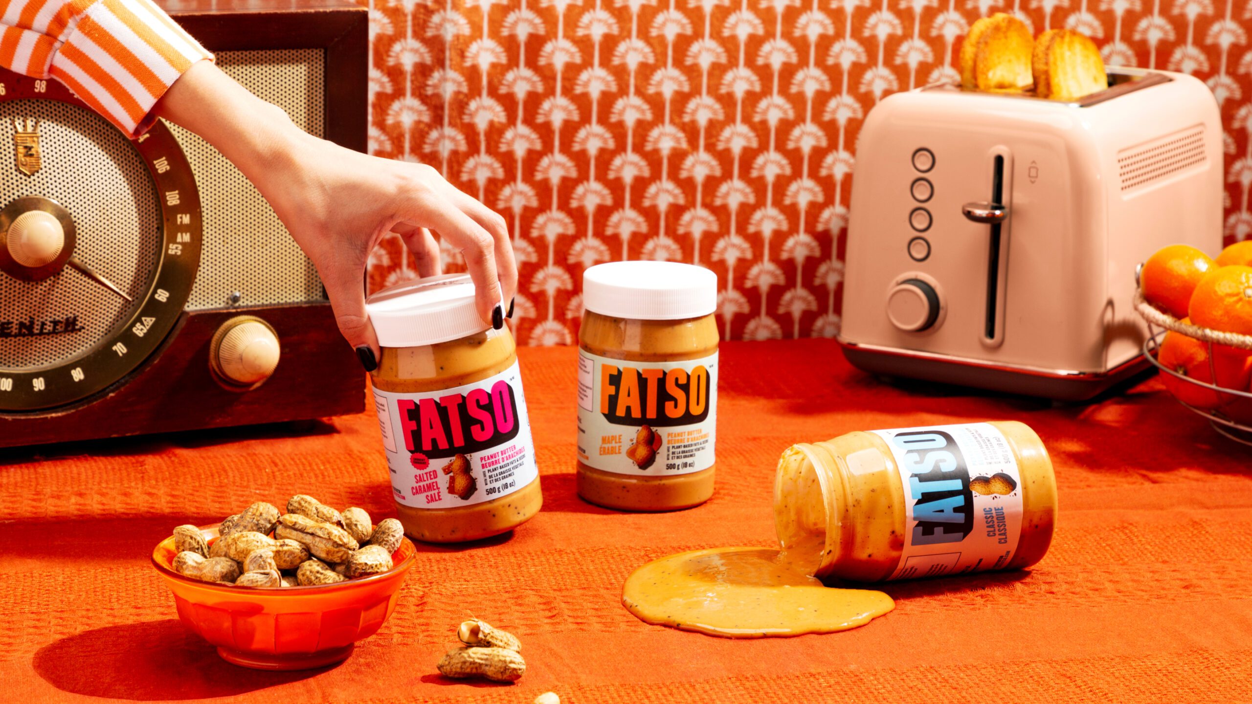
Vibrant colors, a custom typeface and impossible-to-miss wordmark all combine to give Fatso the attention it deserves.
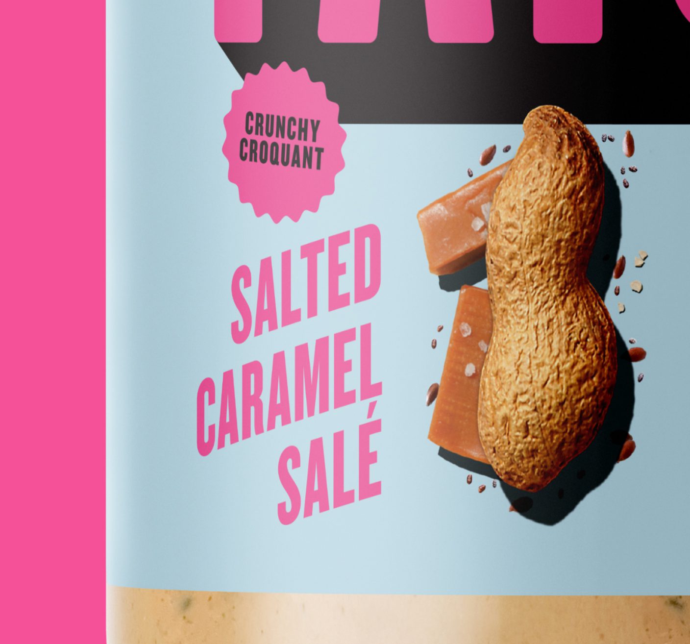
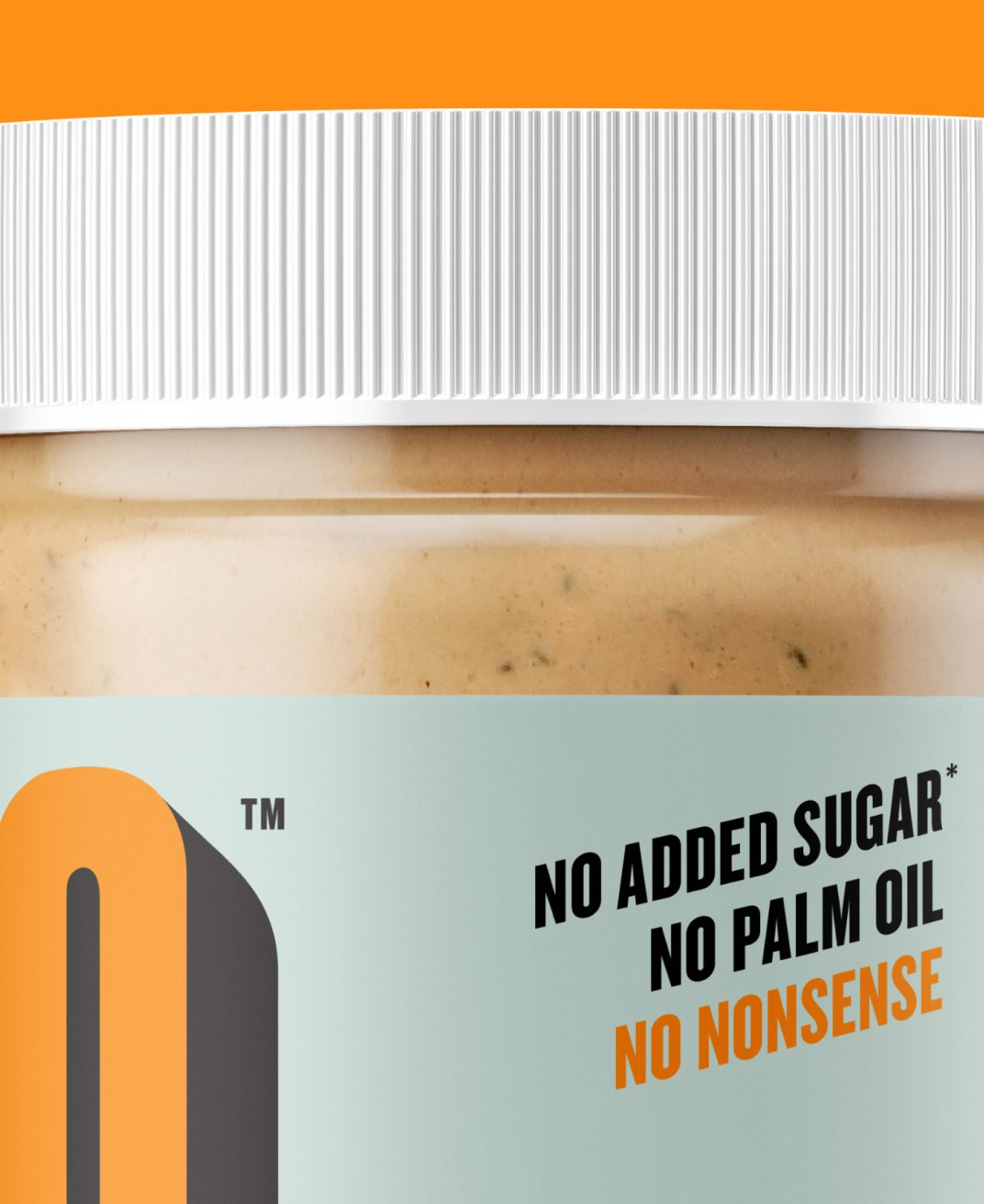
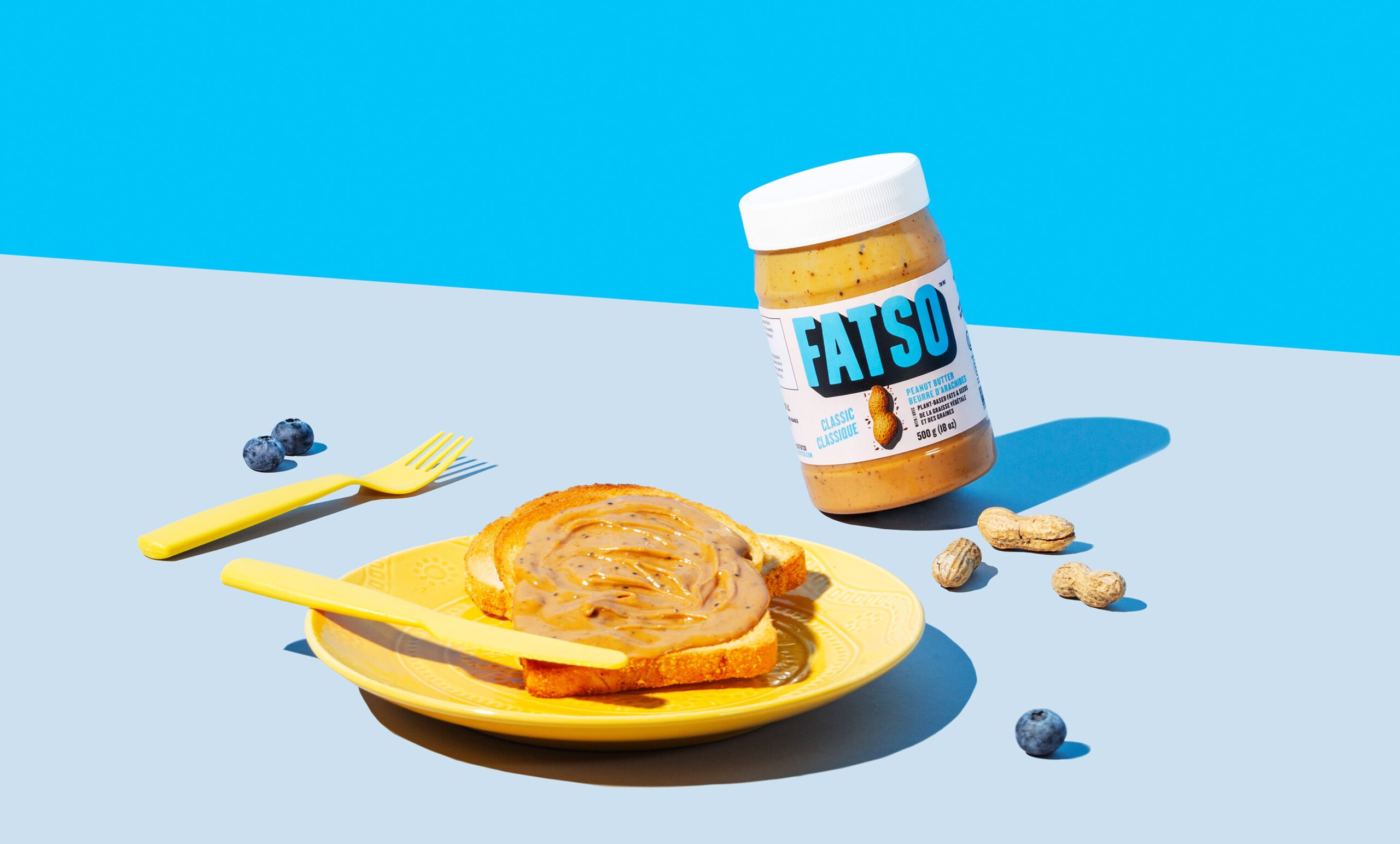
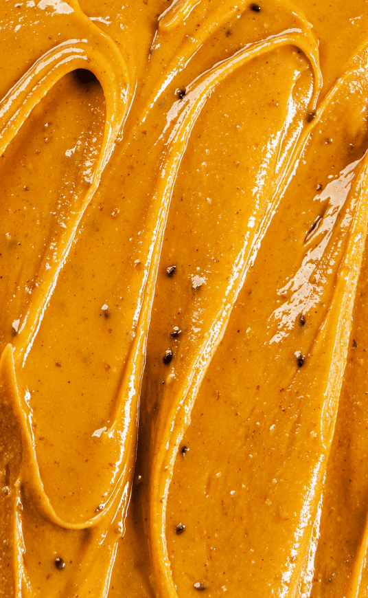
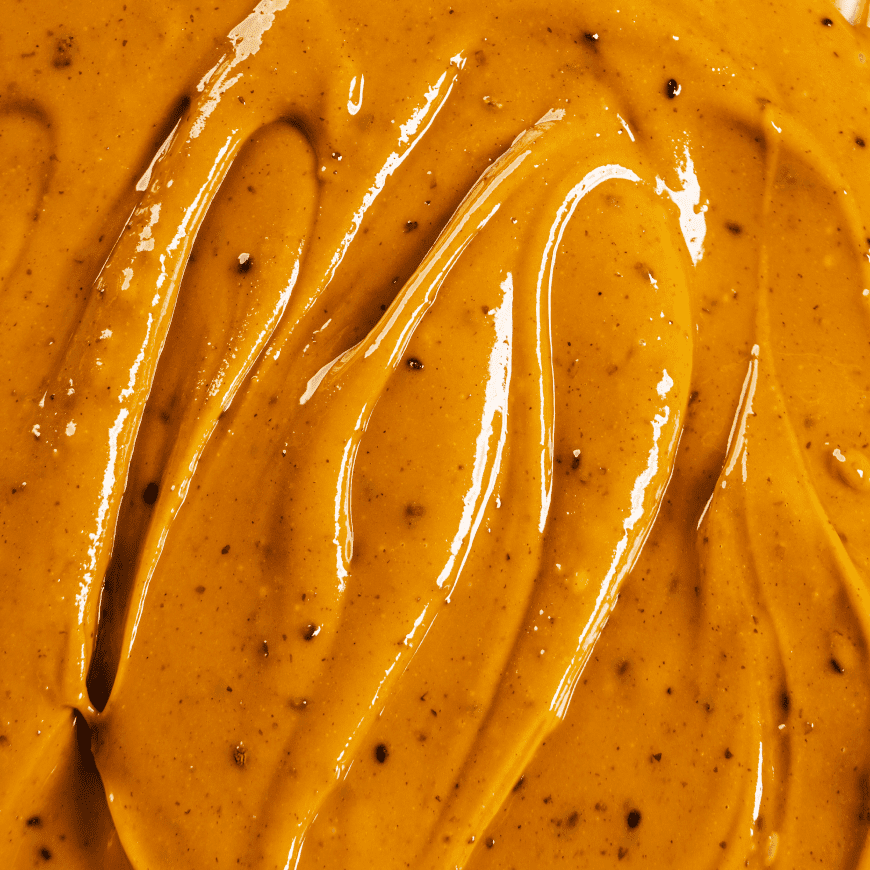
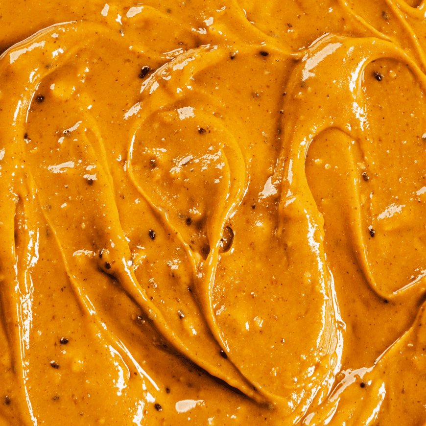
The packaging showcases the flavor profiles and taste in a creative way that stands out from competitors.
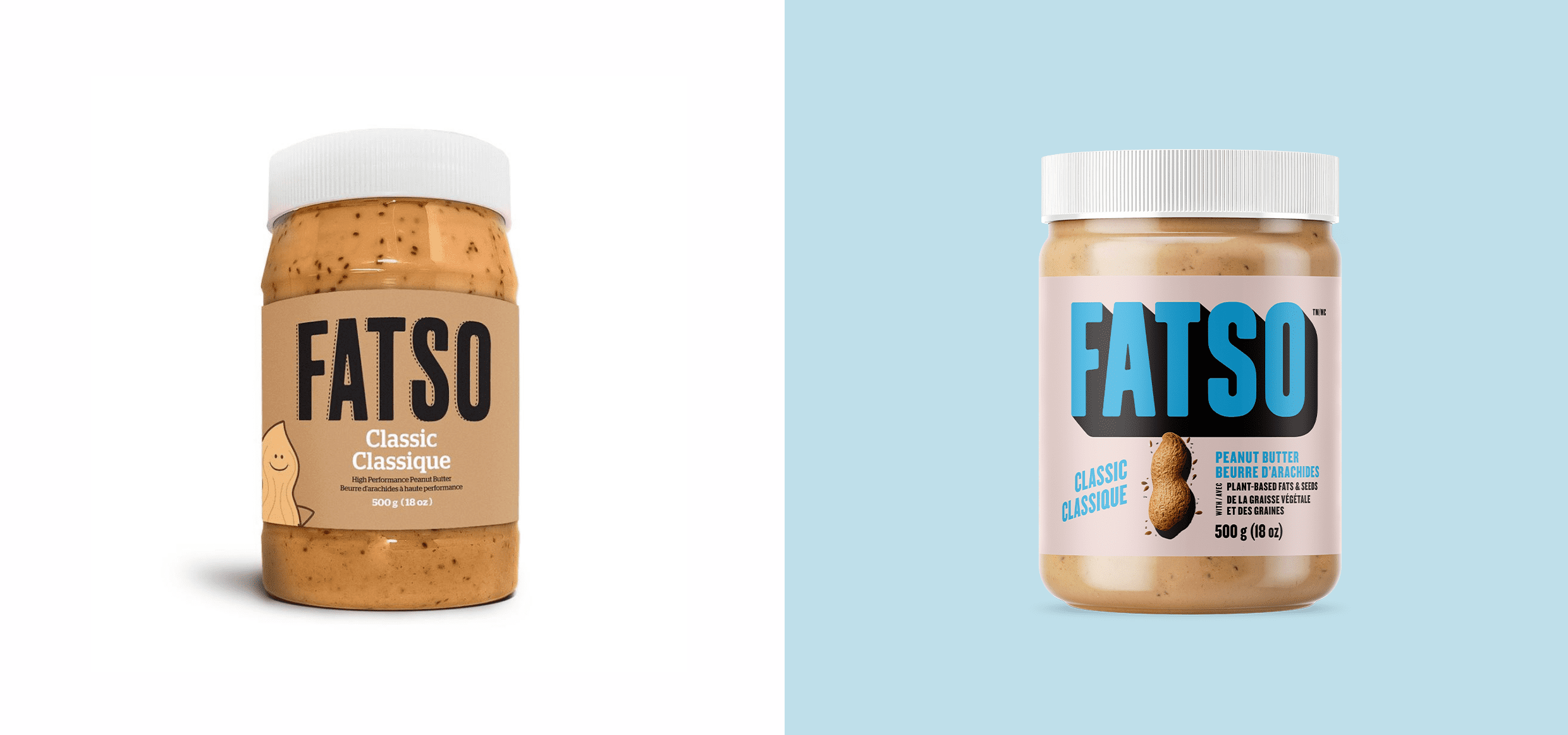
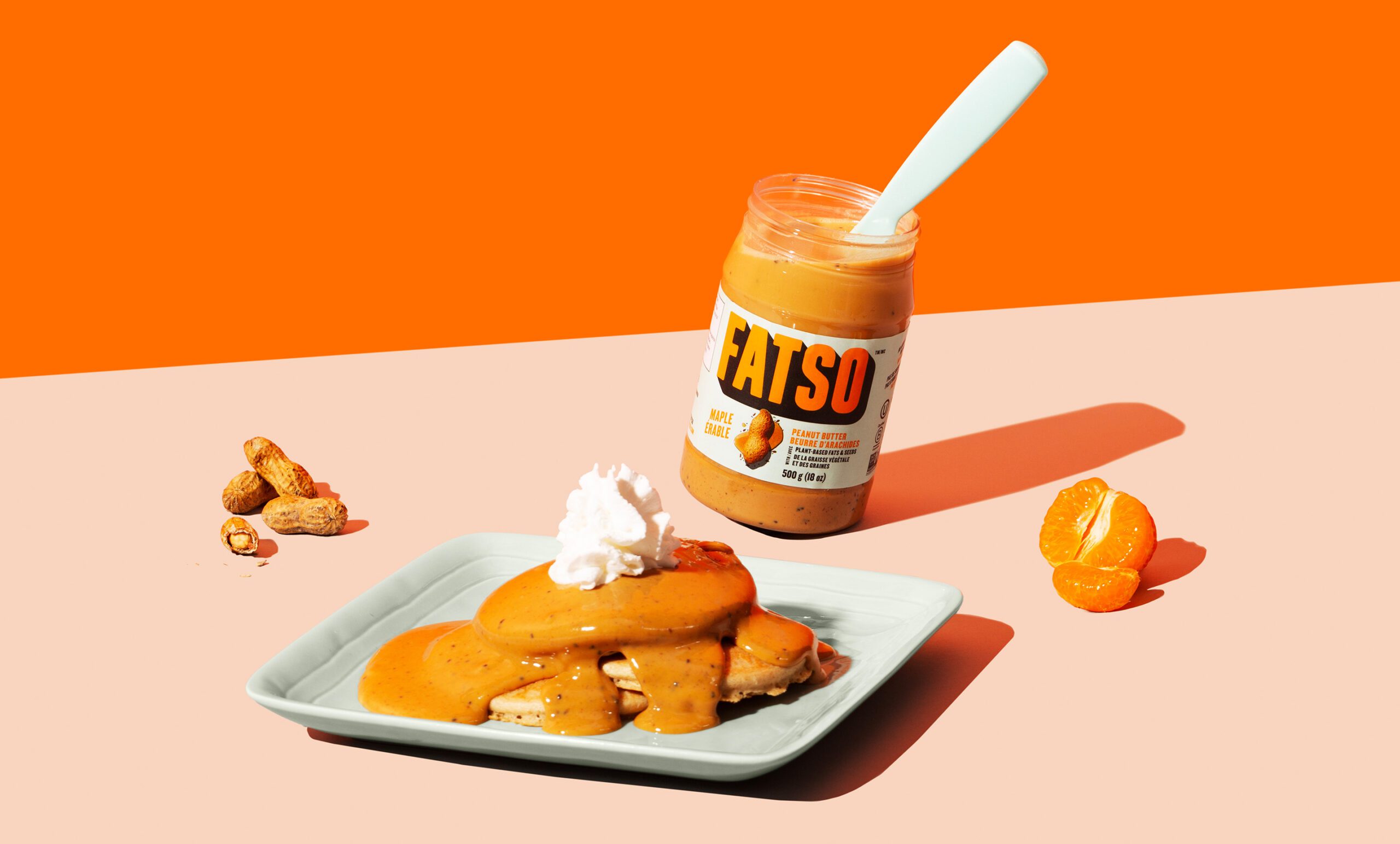
We leaned into Fatso's bold name and playful attitude.
Breaking past brand bias isn't easy, especially when consumers aren't looking for something new.
Listed at Whole Foods (US & Canada), Safeway, Save-On Foods, Shoppers Drug Mart, Nester's Market and more, Fatso is positioned to grow.