A brand platform that shines light on moments that make us who we are.
| Client | SunRype |
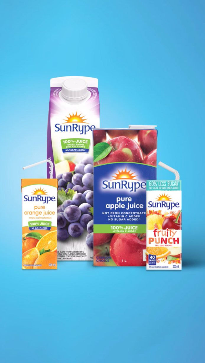
| Work |
|
Challenge
In recent times, there's a clear trend of consumers drinking less juice.
Like its carbonated cousin, the juice category hasn’t had an easy journey. More recently, when consumers do reach for juice, it's often private-label options they choose.
Strategy
When consumers are in the mood for juice, make sure they choose SunRype.
To achieve this, we needed a solid brand platform that reinforced SunRype's appeal, ensuring consumers reached for us over competitors and private label options.
Results
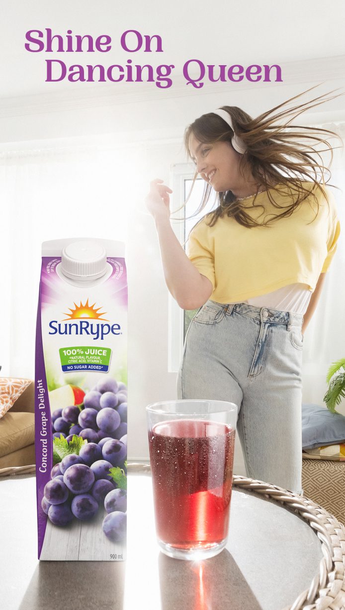
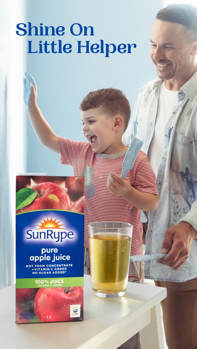
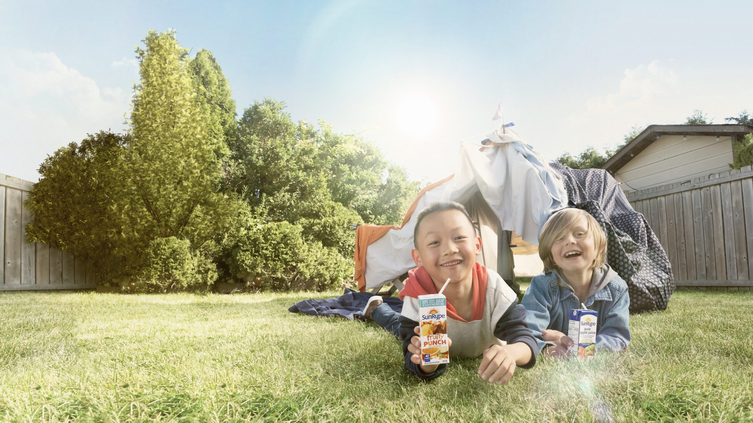
A brand platform inspired by the sun; bringing warmth and light to our lives.
We developed 'Shine On,' a brand platform that acted as a guiding light for SunRype's overall marketing and communications. We drove differentiation through light and warmth.
Our goal was to create an emotional connection to the SunRype brand by showcasing how SunRype beverages enhance 'Shine On' moments in consumer’s lives.