

How do you evaluate a logo design?
Think about it: how do you really judge a logo’s effectiveness?
Evaluating a logo design might seem tricky, but we promise asking the right questions makes the process a whole lot easier.
Designers at Crew use a specific set of criteria when evaluating a logo.
One particular line of questioning we’ve found to be valuable is borrowed from celebrated American art director and graphic designer Paul Rand.
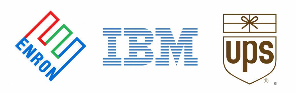
Paul was best known for his iconic corporate logo designs for brands such as IBM, Enron, and UPS. [1]
He was also an author and educator who wrote several influential books on design, including “Thoughts on Design,” and he taught design at Yale University for over 30 years, shaping the minds of future logo designers.
In one of his pieces of writing, Paul wrote the following:
"The principal role of a logo is to identify, and simplicity is its means… Its effectiveness depends on distinctiveness, visibility, adaptability, memorability, universality, and timelessness."
Not only does Paul's quote emphasize the key qualities that make a logo effective, this quote can became a kind of benchmark when evaluating logo designs.
Ask yourselves these questions when evaluating a logo:
Is it Distinctive?
Does the logo stand out in your industry and stand apart from your competition?
Is it Visible?
Is the logo noticeable and easily seen? Designers often start with a black and white application to ensure optimal visibility independent of colour.
Is it Adaptable?
Does the logo work regardless of where it’s placed, e.g. on a business card, online, on a truck, on road sign or a piece of clothing?
Is it Memorable?
Is it intuitively memorable by its meaning, shape or form? Is it clever? Does it make you smile? Does it provoke you in any way?
Is it Universal?
Does the logo carry a consistent meaning to a diverse audience? This is especially important for global brands, but also important for local organizations given the diversity of our multi-cultural society
Is it Timeless?
Certain colours, typefaces and styles can go in and out of style quickly. Will the logo have staying power even after current design fads have passed?
Is it Simple?
This is arguably the most important criteria. Is the logo simple? Try shrinking it down or blowing it up. Does it work at any size? Can it be drawn by hand in 10 seconds?
How do we judge if a logo needs to be redesigned in the first place?
Deciding if a logo needs a redesign again starts with asking the right questions.
- Does our logo still represent our current positioning well?
- Does it connect with our audience?
- What's driving our need for a logo-redesign?
- Do we need a logo update? Or a complete rebrand?
Gathering insights through questions like these can be incredibly useful.
For example, a logo redesign is usually more aesthetic problem trying to be solved (eg. legibility, modernization, clarity, etc.) whereas a re-brand generally is a re-positioning of your entire product/business in comparison to your competitors; and that comes with broader product, pricing, communication considerations, as well as far more creative updates than just one's logo.
If your current logo feels outdated, hard to read, or lagging visually to what your competitors are doing, it might be time for a redesign.
Now, you be the judge...
Here are some logos that have recently come out of our design team. Try evaluating them based on the above criteria and let us know what you think.
"A logo cannot survive unless it is designed with the utmost simplicity and restraint."
- Paul Rand

As part of the process of designing packaging for the new Gojoy Superfruit Smoothie Booster, we designed a logo for the Gojoy brand. They did the impossible by successfully growing Goji berries, the superfruit native to Asia, in Canada – when everyone else said it couldn’t be done. The goal with this logo was to reflect the joy of this success and the brand’s pride in offering a very special product to consumers. The colours were based on the relatively unknown goji berry itself, which is featured prominently on the package. One of the most effective design tools for memorability is to put a smile in the mind of the viewer – a delightfully natural expression for this brand.
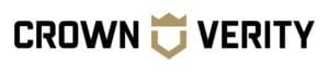
Crown Verity designs and manufactures premium, commercial grade food service equipment. Our objective with the new logo was to help Crown Verity develop a clear, confident and premium look. We designed a logo that used strong, classic and timeless typography. References to ‘crown’ are sophisticated and stylized. The overall impression is one of elite performance that is innovative and trustworthy.

We helped DeVry Greenhouses launch a new online-based product called Garden Starters. Inspired by the creation of a garden, this logo combines linear and structural elements to illustrate a gardeners’ starting point, much like a blueprint or drawing. A solid black logo remains true to the notion of a starting point when an individual’s garden is planned. The typeface has both pure and complementary qualities that represent the beauty in both format and order.